Introduction

Tailwindest is a lightweight and fast className generation library only for tailwindcss. With type safety, maintainable class names, and maximized reusable style designs, you can make more robust products.
Classname generator
The fact that tailwindest is a string generator gives it the following advantages.
- Tiny bundle size,
768B - Independency of framework and environment
- Zero compile steps
Elegant conditional styling
The easiest way to understand conditional styling is to think of switches. We're surrounded by them all the time: we turn lights on and off, and our beloved keyboards are all switches. Conditional styling can also be thought of as a type of switch (albeit a physical one).
Toggle switch
The simplest switch is a toggle, which can only express two states: on/off. Let's use this concept in programming.
You need to create a button that supports dark/light mode, i.e and its style should change depending on the value of a boolean variable called isDarkMode.
It's like a light switch: pressing it (on = true) turns it on (light mode), pressing the other side (off = false) turns it off (dark mode).

const themeBtn = tw.toggle({
    base: {}, //    base style definition
    truthy: {}, //  dark mode style
    falsy: {}, //   light mode style
})
const ThemeBtn = ({ children }) => {
const [isDarkMode, setIsDarkMode] = useState(false)
return <button className={themeBtn.class(isDarkMode)}>{children}</button>
}Rotary switch
But in the real world, we can't express everything with a toggle switch, so we need to create a switch that's a step more complex: a rotary switch. If you've ever used a microwave oven, it's easy to understand! From steps 1, 2 to 10, we can fine-tune the time and intensity we want with a rotary switch. So, for example, if we want to present a UI with 4 states: default, success, failure and pending, we can import the concept of a rotary switch: if it's success, we can associate a style for success, if it's failure, we can associate a style for failure, and so on.

const button = tw.rotary({
    base: {}, //    base style definition
    default: {}, // default style
    success: {}, // success style
    error: {}, //   error style
    pending: {}, // pending style
})
const Button = ({
children,
type = "default",
}: {
children: ReactNode
type: GetVariants<typeof btn>
}) => {
return <button className={button.class(type)}>{children}</button>
}Combination of rotary, variants
However, there may be times when we need a few more states. In other words, we may need to create multiple rotary switches to represent more complex states.
This is where the variants comes in.
variants are combinations of rotary switches - think of the microwave at home. You'll notice that it has a few rotary switches, such as time and an intensity.
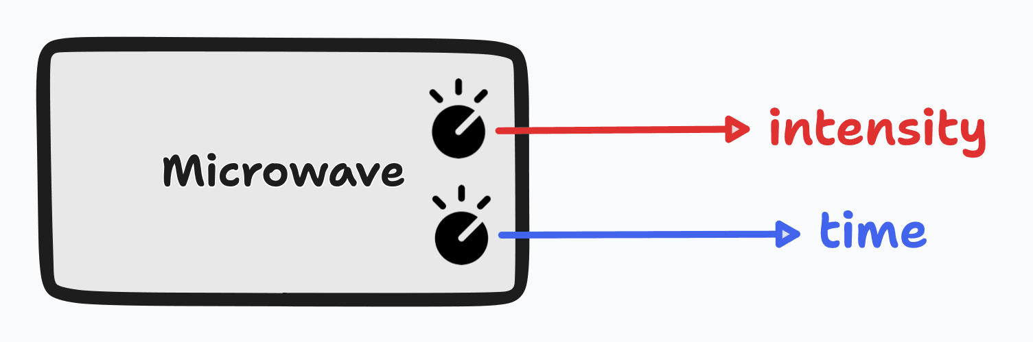
Similarly, with variants, you first create a category of switches for each of the criteria you need to adjust, and then just combine them.

const button = tw.variants({
    base: {},
    variants: {
        type: {
            default: {},
            success: {},
            error: {},
            pending: {},
        },
        size: {
            sm: {},
            md: {},
            lg: {},
        },
    },
})
interface BtnProps extends GetVariants<typeof btn> {
children: ReactNode
}
const Btn = ({ children, type = "default", size = "md" }) => (
<button
className={btn.class({
type,
size,
})}
>
{children}
</button>
)Pros and cons
Pros
-
Type-safety -
Readability -
Reusability -
Maintainability
Cons
- Takes a little longer to write style
- Verbose than original tailwind
Conclusion
The great thing about tailwind is that it makes it quick and easy to get your product done. But it introduces new problems: readability and maintainability. In contrast, tailwindest can't get your product done any faster than regular tailwind. It specializes in designing products that are easy to refactor and robust style.
Now just combine the best of both worlds
if your className is too long to maintain, write it with tailwindest, but
if it's short and easy to read, write an inline className.
If you apply tailwindest in the right circumstances, you can build a much more robust product with tailwind.
Real world adaptation
- Short
className:inline-class - Complex & Reusable
className: tailwindest
The code below is the Card component in the Feature on the main page.
Original
export const Card = ({
    onClick,
    children,
    icon,
}: {
    onClick: () => void
    icon: ReactNode
    children: ReactNode
}) => {
    return (
        <button
            type="button"
            onClick={onClick}
            className="flex flex-col items-start justify-between gap-2 p-2 hover:translate-y-[1.5px] hover:border-transparent hover:opacity-100 active:border-amber-400/10 active:opacity-75 transition-all ease-in duration-75 select-none sm:flex-row sm:items-center sm:p-2.5 bg-amber-600/10 rounded border-amber-400/20 border"
        >
            <div className="w-6 h-6 min-w-[1.5rem] min-h-[1.5rem] p-1 bg-gradient-to-bl from-amber-700/30 to-amber-700/50 border-amber-400 border rounded md:w-7 md:h-7 md:min-w-[1.75rem] md:min-h-[1.75rem] md:p-1.5">
                {icon}
            </div>

            <div className="font-bold text-sm md:text-base md:font-semibold text-start">
                {children}
            </div>
        </button>
    )
}
Build with tailwindest
import { tw } from "~/tw"

// 💡 Reusable className
export const cardContainer = tw.style({
    backgroundColor: "bg-amber-600/10",

    borderRadius: "rounded",
    borderColor: "border-amber-400/20",
    borderWidth: "border",
})

// 💡 Long className
const card = tw
    .style({
        display: "flex",
        flexDirection: "flex-col",
        alignItems: "items-start",
        justifyContent: "justify-between",
        gap: "gap-2",

        padding: "p-2",

        ":hover": {
            transformTranslateY: "hover:translate-y-[1.5px]",
            borderColor: "hover:border-transparent",
            opacity: "hover:opacity-100",
        },
        ":active": {
            borderColor: "active:border-amber-400/10",
            opacity: "active:opacity-75",
        },
        transition: "transition-all ease-in",
        transitionDuration: "duration-75",
        userSelect: "select-none",

        "@sm": {
            flexDirection: "sm:flex-row",
            alignItems: "sm:items-center",
            padding: "sm:p-2.5",
        },
    })
    .compose(cardContainer.style)

// 💡 Long className
const cardIcon = tw.style({
    width: "w-6",
    height: "h-6",
    minWidth: "min-w-[1.5rem]",
    minHeight: "min-h-[1.5rem]",

    padding: "p-1",

    backgroundImage: "bg-gradient-to-bl",
    backgroundImageGradientStart: "from-amber-700/30",
    backgroundImageGradientEnd: "to-amber-700/50",

    borderColor: "border-amber-400",
    borderWidth: "border",
    borderRadius: "rounded",

    "@md": {
        width: "md:w-7",
        height: "md:h-7",
        minWidth: "md:min-w-[1.75rem]",
        minHeight: "md:min-h-[1.75rem]",

        padding: "md:p-1.5",
    },
})

export const Card = ({
    onClick,
    children,
    icon,
}: {
    onClick: () => void
    icon: ReactNode
    children: ReactNode
}) => {
    return (
        <button type="button" onClick={onClick} className={card.class}>
            <div className={cardIcon.class}>{icon}</div>
            {/* ⚡️ Short and don't have to reuse it */}
            <div className="font-bold text-sm md:text-base md:font-semibold text-start">
                {children}
            </div>
        </button>
    )
}
How need it?
- Wants type-safe tailwind
- Wants full type definition of tailwind
- Wants great conditional styling DX, like
cva&stitches